BLUE WALLPAPER : THE 50 SHADES
Trends & Tips | Mars 20For a few years now, blue has come back to the forefront and dresses our walls. It is more than ever in the major decoration trends. Klein, duck, sudan, turquoise, indigo, lagoon, midnight blue, blue green, pastel… there is something for every colour and taste. So which blue to choose? Here are a few ideas to adopt the colour blue in your interior.
Blue: what does it mean?
This colour has many symbolic meanings. First of all, it echoes the Earth, our dear blue planet, obviously recalling the colour of the sky or the ocean. It also evokes serenity, freshness and dream. Blue is also the horizon. This colour is simple, eternal and has the power to calm the atmosphere.
How to use blue?
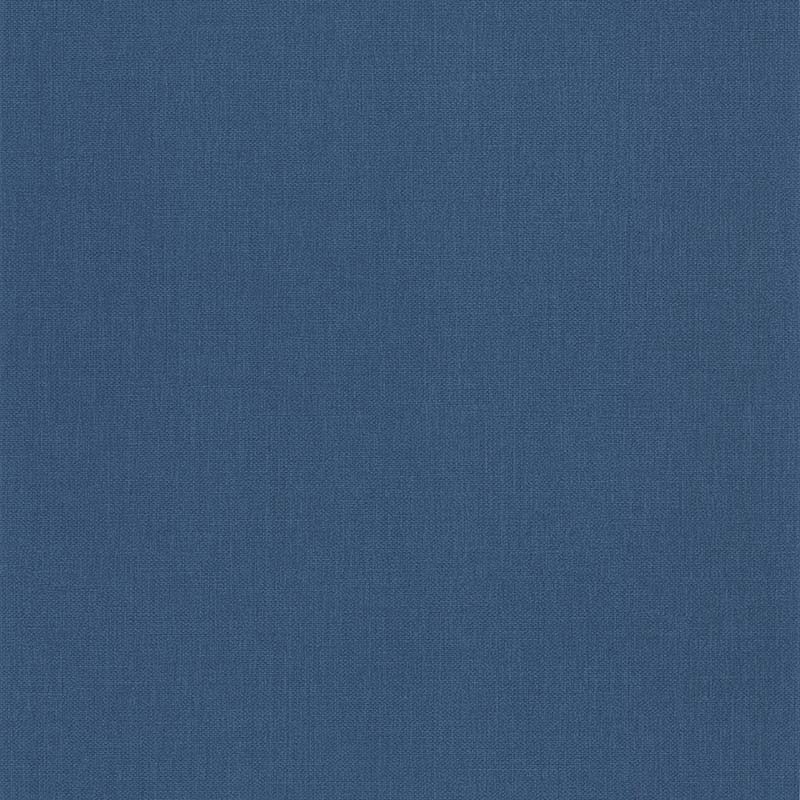
Blue is basic and timeless. Whether it is plain or patterned, whether you use it as a total look or on a single section of wall, wallpaper in shades of blue is a welcome addition to any room in the house. Whether it’s at the headboard in the bedroom, on a wall in the living room or from the bathroom to the kitchen, it fits in any setting.
Dare a midnight blue or peacock blue for a refined and intense decoration. Think especially about its use. Indeed, as it is rather a cold colour, it is advisable to use it for rooms exposed to the south which benefit from the good rays of the sun. It is not for nothing that blue combines perfectly with yellow to create a contrast between cold and warmth.
Find the LUTECE blue wallpapers!
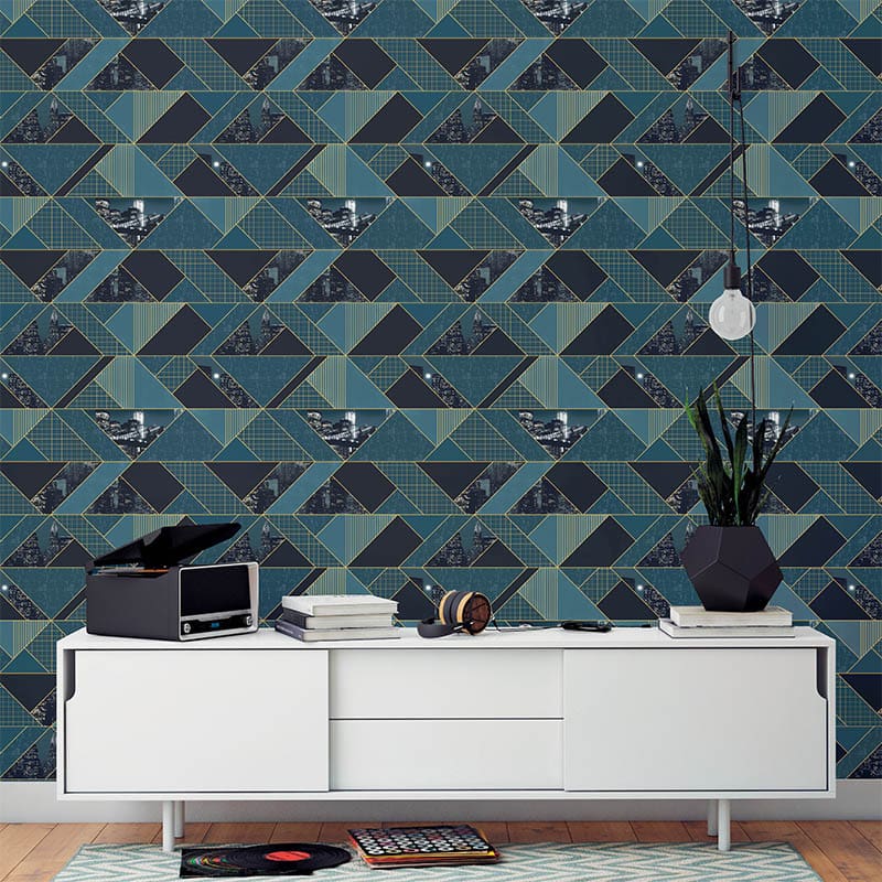
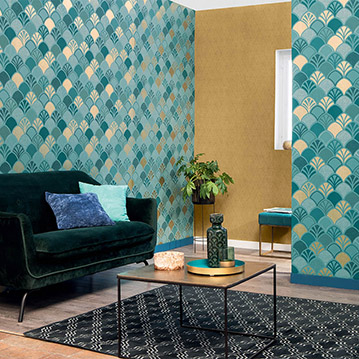
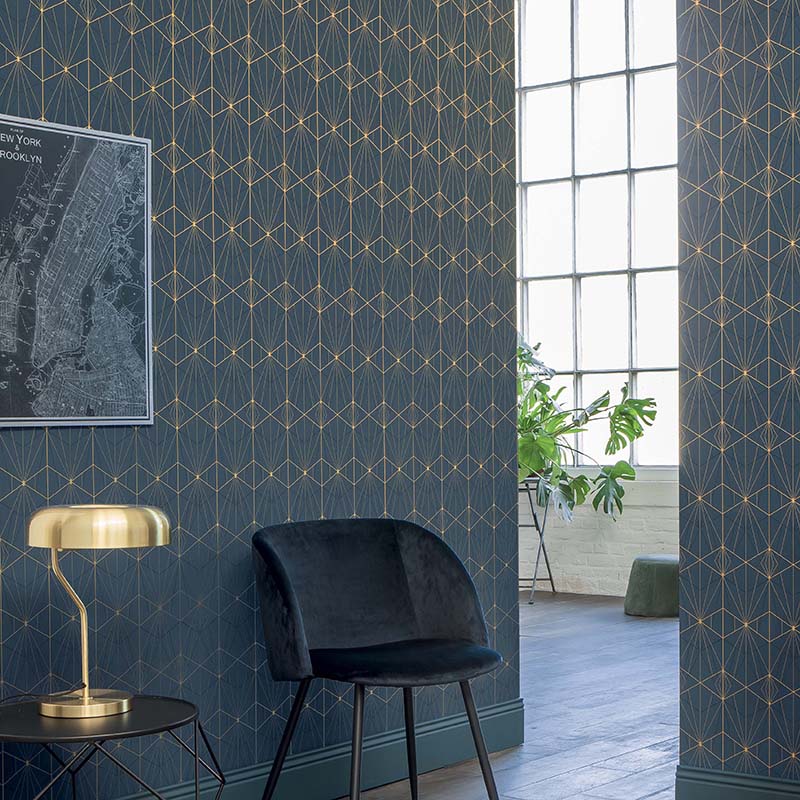
Very trendy, the colour blue is very present in our collections and in different forms. For example, Blue is associated with gold for a city or art deco style in the Park Avenue collection.